Adding glyphs on scatterplot
Wayne Oldford and Zehao Xu
2022-10-22
glyph.RmdGlyphs can be used as point symbols in a scatterplot to convey more information on each point. This information could range from providing a more evocative picture for each point (e.g., an airplane for flight data or a team’s logo for sports data) to incorporating quantitative information (e.g., the values of other variables in a serial axes or star glyph or as a Chernoff face).
In ggmulti we provide “glyph” layers to help add this
information as point symbols on a plot (Waddell and Oldford
2020).
Polygon glyphs
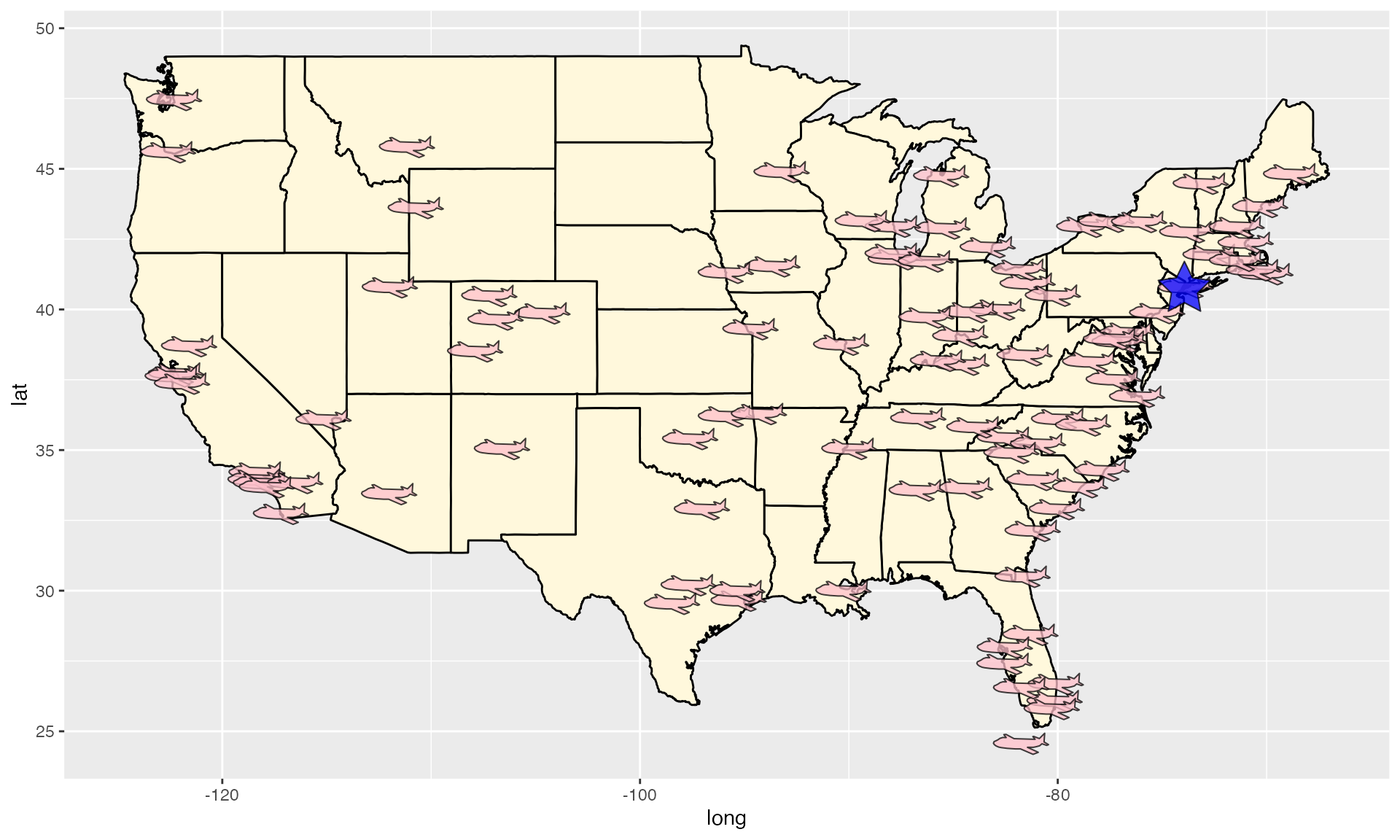
Consider, for example, the lower 48 USA destinations of “nyc” flights in 2013. Each destination could be marked as a “airplane” polygon symbol and New York city is highlighted by a blue star.
library(ggmulti)
library(nycflights13)
library(maps)

# Flight destinations
destinations <- nycflights13::airports %>%
  dplyr::rename(dest = faa) %>%
  dplyr::semi_join(nycflights13::flights, by = "dest") %>%
  dplyr::mutate(tzone = gsub("America/", "", tzone)) %>%
  dplyr::filter(lon > -151,
                lat < 55)

# New York City coordinates
NY <- data.frame(
  lon = -73.935242,
  lat = 40.730610
)
US <- map_data("state")  %>%
  ggplot(aes(long, lat)) +
  geom_polygon(mapping = aes(group = group),
               color="black", fill="cornsilk")
NYflightDestinationMap <- US +
  geom_polygon_glyph(data = destinations,
                     mapping = aes(x = lon, y = lat),
                     fill = "pink",
                     # negate x to have each plane face west
                     polygon_x = -x_airplane,
                     polygon_y = y_airplane,
                     alpha = 0.75) +
  geom_polygon_glyph(data = NY,
                     mapping = aes(x = lon, y = lat),
                     polygon_x = x_star,
                     polygon_y = y_star,
                     alpha = 0.75,
                     fill = "blue")
NYflightDestinationMap
Package “ggmulti” provides several polygon coordinates that can be
used in geom_polygon_glyph, check
help("polygon_glyph", "ggmulti").
Image glyphs
We can also load image files (png, jpeg, etc) and set each image as a point glyph. Let’s draw a chart of two 2020 Final NBA Teams.
library(png)
img_path <- list.files(file.path(find.package(package = 'ggmulti'),
                                 "images"),
                       full.names = TRUE)
Raptors <- png::readPNG(img_path[grepl("Raptors", img_path)])
Warriors <- png::readPNG(img_path[grepl("Warriors", img_path)])
# Golden State Coordinate
GoldenState <- data.frame(
  lon = -119.4179,
  lat = 36.7783
)

Toronto <- data.frame(
  lon = -79.3832,
  lat = 43.6532
)

# Get the Canada lakes
cdn.lakes <-  maps::map("lakes",
                        plot=FALSE,
                        fill=TRUE)$names[c(7,8,27,22, 25,
                                           68:73, 82, 85
                        )]

US +
  geom_polygon(
    data = maps::map("world",  "Canada", fill=TRUE, plot=FALSE),
    mapping = aes(long, lat, group = group),
    fill="#ffcccb", colour = "black"
  ) +
  geom_polygon(
    # lakes in Canada
    data =  maps::map("lakes", cdn.lakes, plot=FALSE, fill=TRUE),
    mapping = aes(long, lat, group = group),
    fill="lightblue", colour = "black"
  ) +
  geom_image_glyph(data = GoldenState,
                   mapping = aes(x = lon, y = lat),
                   images = Warriors,
                   imagewidth = 1,
                   imageheight = 1,
                   colour = NA,
                   size = 3) +
  geom_image_glyph(data = Toronto,
                   mapping = aes(x = lon, y = lat),
                   imagewidth = 1,
                   imageheight = 1,
                   colour = NA,
                   size = 3,
                   images = Raptors) +
  ggtitle("2019 NBA Finals")
Serialaxes glyphs
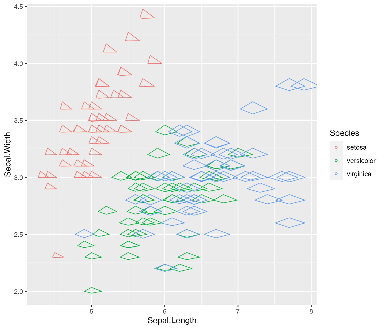
Additionally, ‘serial axes’ can also be drawn as glyphs.
ggplot(iris) +
  geom_serialaxes_glyph(
    mapping = aes(Sepal.Length, Sepal.Width, colour = Species),
     # set serial axes data set (could be different from the original data)
    serialaxes.data = iris,
    # parallel or radial axes
    axes.layout = "radial",
     # sequence of serial axes
    axes.sequence = colnames(iris)[-5]
  )
In this figure, we can tell the specie ‘setosa’ lays on the left top corner and the glyph shape is like a triangle that is very distinguishable from the rest two species.